COVID "Vaccines" Designed to Slow Kill

Henry Makow
"To understand what is happening with the Covid vaccine, imagine the food companies trying different doses of salmonella to determine how much damage they would cause.
Explaining this data with chance alone is far-fetched. The most likely explanation is it was a study designed to show that higher doses of these poisons injure and kill more people. We were and are being slaughtered like guinea pigs."
"Since the lots above the red line are only .65 percent (.0065) of the total, there is about a 1/200 chance that any given jab contains these very toxic contents. After two injections, your chances of getting a bad one of course doubles."
The Hot Lots Turn COVID Vaccine Into Russian Roulette
Robert Yoho MD (Ret)
(henrymakow.com)
If you play Russian Roulette by spinning a six-shot revolver's cylinder using one bullet, your chance of dying is one in six. If you play Covid vax roulette, your chance of dying or being mortally wounded is about one in 200. The following is how to calculate your odds.
This is derived from Craig Paardekooper's Covid vaccine VAERS database analysis. HERE is the video showing his graphs and explanations. Here is a video covering this subject.
VAERS, the Vaccine Adverse Event Reporting System, is the US government database that records the vaccine adverse events (AEs) reported by doctors and others. It is an incomplete but immense sample that lists the batches or "lots" for each company in the order they appeared. It also shows AEs by lot number and date of occurrence. The data is primarily from the USA.
"Hot lot" is a research phrase that the vax makers wish you would never hear. The original meaning was a defective product, such as baby spinach recalled for salmonella contamination. To understand what is happening with the Covid vaccine, imagine the food companies trying different doses of salmonella to determine how much damage they would cause. Paardekooper's analysis is robust evidence that the Pharma companies did precisely that. They used us like lab rates to test their poisons.
He analyzed the Covid jab harms recorded by VAERS and created the charts below, and I copied them from his video. This provides overwhelming evidence that the three manufacturers coordinated dose-response experiments to measure the toxicity and deaths from the different batches of their drugs. Controls without the poisons were likely used as well.
The odds of the results described below happening by chance alone seem nonexistent, but do not take my word for it. Look at the following summary, the references, and the videos.
The entire study is shown in the first slide below. The horizontal axis is time. Each blue dot is a manufacturing batch or lot that includes thousands of bottles with the same serial number. The higher on the vertical axis a blue dot appears the more deaths and other AEs were reported for the lot. The experiment was run over most of 2021.
VAERS, the Vaccine Adverse Event Reporting System, is the US government database that records the vaccine adverse events (AEs) reported by doctors and others. It is an incomplete but immense sample that lists the batches or "lots" for each company in the order they appeared. It also shows AEs by lot number and date of occurrence. The data is primarily from the USA.
"Hot lot" is a research phrase that the vax makers wish you would never hear. The original meaning was a defective product, such as baby spinach recalled for salmonella contamination. To understand what is happening with the Covid vaccine, imagine the food companies trying different doses of salmonella to determine how much damage they would cause. Paardekooper's analysis is robust evidence that the Pharma companies did precisely that. They used us like lab rats to test their poisons.
He analyzed the Covid jab harms recorded by VAERS and created the charts below, and I copied them from his video. This provides overwhelming evidence that the three manufacturers coordinated dose-response experiments to measure the toxicity and deaths from the different batches of their drugs. Controls without the poisons were likely used as well.
The odds of the results described below happening by chance alone seem nonexistent, but do not take my word for it. Look at the following summary, the references, and the videos.
The entire study is shown in the first slide below. The horizontal axis is time. Each blue dot is a manufacturing batch or lot that includes thousands of bottles with the same serial number. The higher on the vertical axis a blue dot appears the more deaths and other AEs were reported for the lot. The experiment was run over most of 2021.
The same graph, annotated.
Johnson and Johnson ran the first tests. Their results are in the small red rectangle on the left. Next, casualties from Moderna are shown in the left-hand square. J and J did a brief second test (the middle red rectangle). Pfizer took over during the second half of the experiment, and their deaths and injuries are shown in the right-hand box.
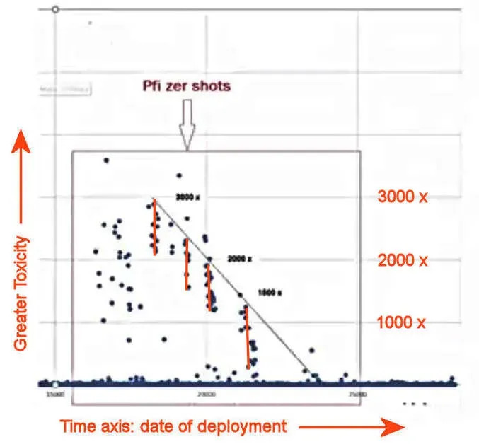
Detail: Pfizer's testing period from the right (later) half of the chart, annotated.
Pfizer's strict quality control is evidence they were running a death study.
Pfizer seems to have systematically deployed batches of varying toxicity and lethality during the last half of the trial.
The adverse reactions for each toxic lot, as revealed by the height of the blue dots above the baseline, are clustered in a limited vertical range and marked in the above graph by the vertical red lines. These likely reflect individual dosages deployed over each limited period.
These results fit along the slanted plot line above. This is striking evidence that Pfizer started with a higher dose at the start (to the left), then decreased it in five steps over the study period. It looks exactly like an injury and lethality dose-response study.
Between each dose tested, there was a "clear" interval. Here, non-toxic, possibly placebo injections seem to have been used, and the adverse events declined to the baseline blue line. When the injuries and deaths from the lots are plotted, the trends are obvious.
Explaining this data with chance alone is far-fetched. The most likely explanation is it was a study designed to show that higher doses of these poisons injure and kill more people. We were and are being slaughtered like guinea pigs.
Original Article: https://henrymakow.com/2022/12/covid-vaccines-designed-to-slow.html
Comments ()