Exactly how many people did the alleged SARS COV 2 virus actually kill? • Did it actually kill anybody?

The Liberty Beacon / Steve Cook
In this featured article, the retired British statistician, John Dee, beginning the process of inviting us to take a close look at this crucial question:
Exactly how many people did the alleged SARS COV 2 virus actually kill?
And some are even asking:
Did it actually kill anybody?
It has already emerged, as the truth inevitably finds its way through the force screens of censorship and official disinformation, that the virus with which the government managed to terrify the citizenry is much milder and less lethal than the propaganda would have us believe.
If you factor in the falsification of the fatality stats, the misuse of the fraudulent PCR test to inflate the numbers, the rebranding, as Dr Vernon Coleman has said, of influenza and similar ailments to lump them all under the Covid19 label, the Midazolam Murders in our cares homes and, as discussed below, iatrogenic deaths, it starts to look as if hardly anybody at all was actually killed by the alleged virus.
Or if they were, the true fatality stats were too low to justify the over-reaction that led to lockdowns and other catastrophes and the reckless rollout of grossly under-tested unsafe and ineffective pseudovaccines.
Meanwhile of course the pseudovaccines rolled out to protect us from an alleged virus that hardly killed anybody, (and probably nobody at all when not assisted by or taking the blame for government/medical ineptitudes of various kinds) are doing a far more deadly job than the “virus” ever did.
Iatrogenesis
Just how many people did COVID actually and truthfully kill?
Get to know this word and what it means because this is where the revelations are going next, and it won’t be pretty.
Back on 25th March 2021 I first used the word when I wrote:
I don’t know about you folks but I’m getting an uneasy feeling that all these exploratory trials designed to test a raft of drug therapies to combat COVID-19 may have generated iatrogenic death on an unprecedented scale via high dose and cumulative toxicity leading to liver failure, sudden cardiac death and multi-organ failure.
This was a comment on the SOLIDARITY, DISCOVERY, RECOVERY, and REMAP drug trials in which incarcerated COVID patients became guinea pigs for a raft of experimental drugs.
Since then I’ve used the word ‘iatrogenic’ 13 times in various posts, which is not a good sign. In a nutshell, It means that a number folk likely died because of medical care, and in this we must include death due to lockdown and other policies as well as closure of health services.
A diabolical example of this is the inexplicable peak in non-COVID care home deaths back in spring 2020; a peak that hasn’t been matched since, and a peak that coincided with evacuation of the frail and elderly from hospital beds, leading to judicious use of end-of-life care pathways (I shall be revising this analysis shortly):

Several times since early 2021 I have questioned whether SARS-COV-2 could be considered as deadly as claimed and, on a couple of occasions, whether there was a virus circulating at all! This wasn’t the result of me wearing foil headgear but basic questioning of the narrative as a consequence of analyses that simply didn’t add up.
Jonathan Engler of HART fame has his sleeves rolled up on this topic and you may find these two articles a good introduction as to where he’s at:
The Lombardy Analysis
Lombardy deaths in March 2020 reveal a pattern which seems difficult to explain by viral spread.
What happened in Lombardy in Spring 2020? Further analysis of Lombardy deaths in March 2020 reveal a pattern which seems difficult to explain by viral spread.
Please start by reading this thread, based on an essay Eugyppius wrote. This was based on a paper suggesting that the "pandemic" passed through Lombardy and was in decline BEFORE any evidence of excess deaths.
To investigate this further it is helpful to examine fine-grained death figures by region, preferably daily. Fortunately (and surprisingly) this data is available, at: https://www.istat.it/it/archivio/240401
A colleague in PANDA has extracted the data (no easy task due to the file formats) and built a tool to graph daily deaths by region and sub-region. The first thing to note (again) from this is the extreme synchronicity of the excess death curves, which begin in March.

This synchronicity is in itself surprising in the context of a "spreading" virus. The next thing to note is the height and sharpness of the peaks in deaths.
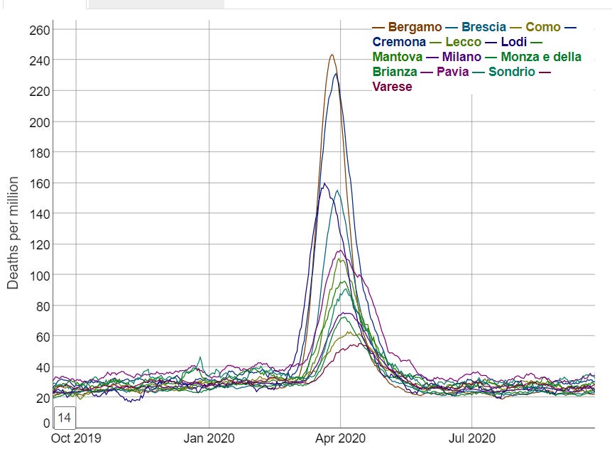
Homing in specifically on Bergamo:

Daily deaths usually bottom out at in the mid-20s in Summer, rising over Winter to mid-30s or 40, over a time period of several months.
In Spring 2020, daily deaths rose from 30 at the end of February to a peak of 336 just 3 weeks later. In percent terms:

This is over 1000% daily excess deaths (though "only" 800% if looking at weekly averages).
This extremely rapid rise and fall, to unprecedented levels, also seen synchronously elsewhere in Lombardy, does not look at all natural.
However, it does resemble another, non-viral incident. In 2003 there was a huge spike in elderly deaths in France, triggered by a heatwave.

That data is, btw, based on weekly numbers. The % excess stands out like a sore thumb. Yet it is only 80% - compared to 800% for Bergamo in March 2020. You can read more about the incident in the European Public Health Journal.
It was actually a national scandal since the conclusion was that most of the deaths could be attributed to neglect. The abstract makes interesting reading indeed.

It seems like the protective measures were largely common-sense "care" and those who didn't receive such care were at massively increased risk of dying. We need to think of the social care apparatus around the frail as their vital life-support system.
I suspect that in many places in Spring 2020, this life-support system was essentially switched off, or certainly substantially downgraded. What happened later is complicated by a number of other factors.
I don't think we are asking the right questions about Spring 2020 at all. Timing of "lockdown" is quite obviously a distraction from the core issue. But I also think natural vs lab origin is not the most pressing question to answer.
To me, the way "lab-leak" was initially verboten, yet now seems to be permissible to talk (and write) about has a smell of being “managed”.
If I imagine that the major part of the mortality had been caused by a variety of policy decisions I had made, the number one thing I'd want is for people to occupy themselves obsessing over the origin of the virus rather than the cause of the deaths.
Imagine that I was heavily involved in the "pandemic preparedness industry" - an industry siphoning billions out of the pockets of taxpayers into my chosen commercial interests. I wouldn’t be bothered about the origin story. Lab or natural - I can make a fortune either way.
What I would be bothered about though would be the idea that this was in fact nowhere near as harmful as the "authorities" told people it was. Because then people might question the need for my new highly profitable industry at all.
I could even tolerate people thinking it was a lab leak. If it was, people will be afraid that it could surely happen again. Because regardless of whatever controls are put in place, some rogue operators could always carelessly carry on doing GoF research.
So natural or lab-leak, as long as we keep the fear going, we surely need to be better "prepared". That's great for business. And great for justifying centralised control.
A more "zoomed out" version of this is: "A virus doesn't spread across thousands of kilometres within days and peaks at the same time."

Were the unprecedented excess deaths curves in Northern Italy in spring 2020 caused by the spread of a novel deadly virus?
A reassessment of the available evidence suggests another factor was involved.
I have learned so many new things during the past few years — one of the few, possibly the only, redeeming features of the “pandemic”.
These lessons span many disciplines: technology, immunology, virology, epidemiology, statistics, philosophy, political theory and public law to name but a few. However, one discipline which I never thought would be relevant to my digging into recent events was geography. This was a subject I detested at school, though in retrospect I am probably not alone in concluding that one’s penchant for any particular subject tended to stem from whether or not you liked the teacher, rather than any personal aptitude for it.
Anyway, it turns out that geography is now a lot more mathematical than it was when I was taught it over four decades ago. I have learned this from a rather lateral-thinking evolutionary biologist in PANDA who feeds me tidbits — with evidence — of what many regard as heretical thinking; however he doesn’t wish to be in the limelight himself. It was he who did the number-crunching on which this analysis of excess deaths in Lombardy is based.
Back to geography and its associated mathematics. Some of the questions people who study geography like to ask are these: to what extent and why are different places similar, or different? What process caused them to be so, and where and when might that process have started?
This has obvious application in analysing the purported spread of a novel deadly virus across the world from Wuhan, as authorities claimed happened in early 2020. As pointed out in several analyses (see, by way of example, these papers reporting data from Italy, the USA, Congo and Brazil), there is growing evidence of the totally unnoticed presence of the virus prior to the purported date of the start of the pandemic and even as early as September 2019. In nearly all papers reporting such data, the significance of there being no excess death observable until the emergency is declared seems to have been missed.
It is worth considering this counterfactual: imagine there was no virus at all, but that for some other reason (any will do) governments decided to institute a range of measures including:
- Telling people not to attend healthcare if they had a cough, fever or other symptoms both to “protect” healthcare and also because any contact with healthcare would quite likely make you contract a deadly disease.
- Telling healthcare staff to isolate if they (or in some cases someone in their household) received a positive test for a certain illness, even if asymptomatic.
- Emptying beds in preparation for being “overwhelmed”.
- Terrorizing and isolating elderly people especially those living in care homes, denying them visits from relatives and reducing or eliminating in-personal visits from health and social carers.
- Using the entire machinery of state plus all social media and legacy mainstream media channels to promote an exaggerated narrative of fear aimed at the public and spilling over into healthcare workers, when it is well established that stress has a number of adverse health effects, including immuno-suppression.
- Massive overuse of a treatment (ventilation) with no solid evidential basis, now known to be extremely harmful.
The implementation of such policies would result in protests in the streets with people declaring that “thousands of people will surely die”, and no doubt they would have been right. It is inconceivable that such policies would not have a significant associated mortality. Recall how a former UK Health Minister, Jeremy Hunt, was vexed by the fact that the (comparatively milder) NHS staffing deficiencies at the weekend measurably increased the risks to patients unfortunate enough to not fall ill during the working week.
It must therefore surely be reasonable to assume that at least some of the deaths which occurred in the aftermath of the cataclysmic changes to the delivery of healthcare — especially of the frail and elderly — might have been caused by policy, rather than virus. The question is: what proportion were caused by such policy changes, and what by the spread of a virus through the population?
The starting point in analysing this question is to ask: what is the evidence of spread of a virus being the cause of the excess death curves observed? Is “spread” able to be measured, and what would be the implications of different findings?
Imagine a forest fire starting in one corner of a dry forest, ignited perhaps by someone leaving a smouldering barbeque lying around. It would start with a single localized cluster of burning, which would then grow and spread in tendrils until a patch of some more dry tinder was found; these areas would then catch fire, perhaps igniting nearby areas by direct contact. Occasionally a spark would fly off or a burning dead branch would fall off a tree, igniting an area slightly further away, and the process would carry on there. After a while, the whole forest would be ablaze, but only for a short time, because it would soon burn itself out, but with various areas going out at different times because the fires did not start in those areas at the same times.
That would be what you’d expect to see when a process spreads from a point source. What you would NOT expect to see would be the entire forest catching fire at the same time and all areas burning themselves out simultaneously. If that happened, most people would assume that something which affected the entire area at the same time — and which did not rely on spread at all — had happened, maybe a huge destructive fireball from a nearby explosion.
One key point in relation to this is that surveying the scene after the event does not really help that much in determining the cause. They look similar in both scenarios — a burnt out forest. You need to look at a time series, ie. how the different areas were affected over time, to find the conclusive evidence of spread.
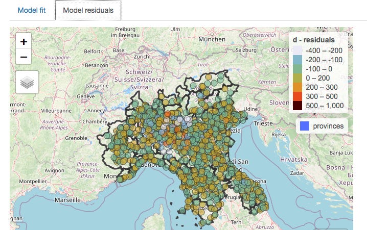
Take a look again at the all-cause death curves in the 13 administrative areas (hereafter termed “provinces” or “administrative areas”) forming the region of Lombardy.
These are not what you would expect at all from spread. From simple observation this suggests a near-simultaneous non-spatially dependent process has operated on the region of Lombardy. Close analysis reveals that the excess death curves for Lodi appear to start around 23 Feb and for all the other areas this happens on or within just a few days of 1 March.
But can this be demonstrated more mathematically?
It turns out that the answer to this is yes — using the measurement of auto-correlation. This is essentially a statistical analysis of the characteristics of neighbouring areas which generates several statistics (the best known of which is “Moran’s I”) which indicate to what extent those characteristics are spatially dependent — i.e. how closely does its value in one area rely on its value in a neighbouring area.
The characteristic we are looking at here is excess death. It is axiomatic that a lethal virus spreading through a population will cause excess deaths if its harm is being added to the usual vicissitudes of life (and death), hence this is an appropriate measure — and a much better one than counting deaths labeled as “covid deaths”, as it removes the variability introduced by differences in testing policies, unreliable tests, and cause of death decisions by doctors.
As pointed out in the Lombardy analysis, we are fortunate that extremely fine-grained daily deaths data is available for Italy; in fact, this is probably the most granular data available anywhere in the world, showing daily deaths occurring in relatively small areas across Italy.
So, what does this more fine-grained analysis show?
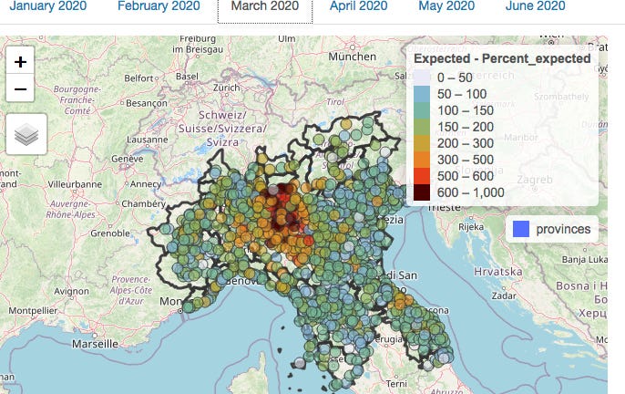
Below depicts the numbers of people dying from all causes across Northern Italy (which includes Lombardy) in February.
The numbers of deaths in each municipality with a population large enough to provide meaningful data (of which there are several hundred in Northern Italy) have been colour-coded according to the numbers of deaths in the month of February compared to the average number observed over the previous 5 years.
The notable observation is that as would be expected in the absence of a pandemic, some areas have deaths a little below “expected” (light blue or grey), some a little above (green or yellow). But the key point is that there are no clusters at all.
There is the occasional area where deaths are more than doubled, but it should be noted that some of these areas are small and actually usually have just one or two deaths in a month so an extra death or two would represent a doubling.
Both the lack of excess deaths overall and the lack of clusters of excess deaths are in fact totally unexpected in light of the evidence — now supported by papers studying antibodies and PCR testing data AND symptoms — of significant presence of Sars-Cov-2 in February (and earlier, in fact).
This graphic, reproduced from The early phase of the COVID-19 epidemic in Lombardy, Italy, Careda et al, shows the estimated reproduction rate derived from symptomatic cases in the various administrative areas of Lombardy.
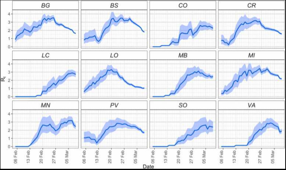
How could an apparently highly contagious and lethal virus have spread throughout the region so much that case growth was apparently actually slowing in most areas by the end of February, without leaving any signal of increased deaths in its wake?
It is worth appreciating that Northern Italy forms a "small world" in the sense that all the towns are well connected with each other. Nevertheless the towns themselves are each very compact. So most contacts between people will be within their own town in which they live, work and socialise. So the expectation — based on earlier emergence of a pathogenic virus capable of causing notable excess mortality — would be for a few of the seeded outbreaks to take off first leading to alarm bells being set off in these towns. Like the fire in the forest.
There would also be a high probability of spread to neighbouring towns/municipalities — again, just like the forest fire; it should be recognised that most contact which might result in viral transmission comes from short distance travel, with longer-distance travel representing some — but less spread.
However, in February there is no visible pattern suggestive of any clustering, and an arithmetic calculation of the degree of auto-correlation (which can be provided to any interested parties) confirms this.
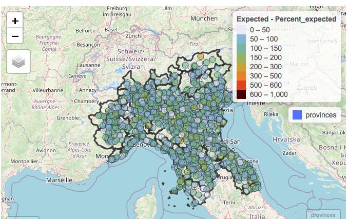
So how about March — the month of the shocking excess death curves?
Here’s the map for March:
At first glance, there is visible clustering, so you would be forgiven for thinking that this represents evidence of viral spread. A statistical analysis for auto-correlation also suggests spread.
However, it is important to realise that auto-correlation can have causes other than biological spread. Each municipality is located within an individual province; differences between these provinces in the administration of health and social care which impacted on death rates would also result in the appearance of clustering. However, this is not due to the spread of a virus but rather due to the similarities between neighbouring municipalities in healthcare policy due to being in the same administrative area.
By fitting a model with 2 components — firstly the administrative province in which the municipality is located, and secondly the death rates in neighbouring municipalities — the effects of province and neighbouring municipality can be analysed separately.
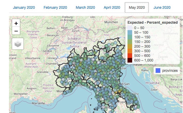
This is what the picture in March looks like when the effect of provincial location has been subtracted mathematically:
The clustering nearly entirely disappears when provincial borders are taken into account (and the statistical analysis confirms this), meaning that which one of the 13 provinces a person lived in was a much better predictor of death than whether there was a high rate of deaths in neighbouring municipalities.
On the assumption that healthcare is organised by province, the conclusion can only be that it was the manner in which healthcare was delivered which was relevant to the death rate, not the spread of a virus, which would of course have no respect for provincial boundaries.
The above discussion covers the period when death rates were climbing. However, there is further supportive evidence to be gleaned from the manner in which excess death rates later declined.
Recall that above I suggested that as the fire in the forest burned out, clusters would die out over a period of time as they started at different times. You would not expect all the fires to go out across the forest at the same time.
Yet the fires did all go out more or less simultaneously in Lombardy. There is a collapse in both excess deaths and any spatial pattern in May.
(An analysis for April — not shown here — is similar to March in that any auto-correlation was weak, and nearly entirely accounted for by provincial location.)
It is worth pointing out, as Michael Senger did in his recent piece, that the proponents of the narrative that “a novel deadly virus spread from Wuhan seafood market starting in Dec 2019” actually themselves rely on spatial analysis and case clustering centred on the market to make their case.
The below are extracted from their paper published in July 2022.
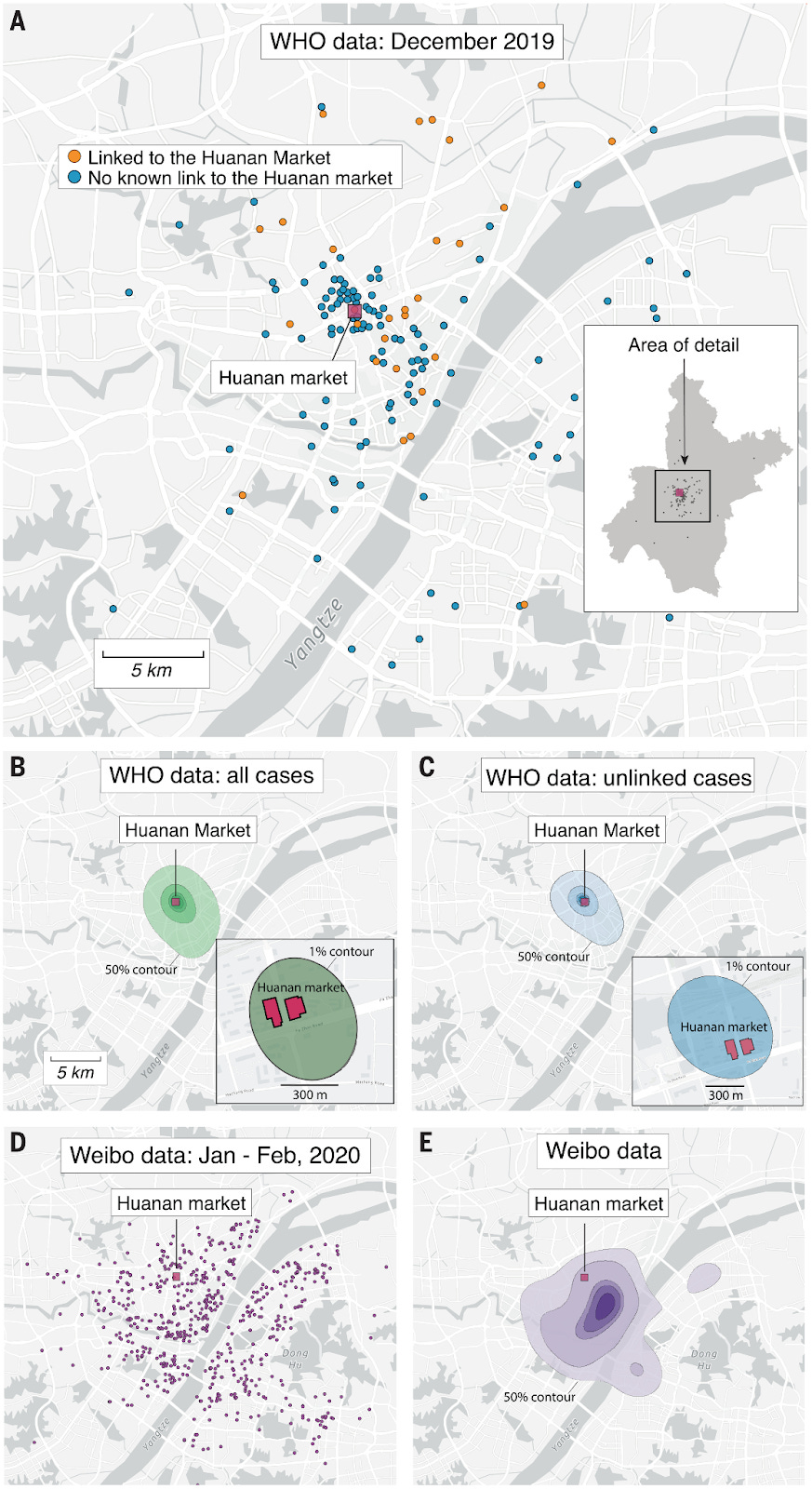
Of course, the emerging evidence of widespread prior spread embarrassingly demolishes this case in the same way as it raises crucial questions about what happened in Northern Italy.
Conclusion and closing remarks
Statistical analysis of auto-correlation of excess deaths in Lombardy in spring 2020 reveals much less clustering than would be expected if a virus spreading across the region was responsible. What small amount of clustering is observed appears to be more related to differences between the administrative regions in which the municipalities are located.
These observations surely raise questions which need answering around the causes of the high rates of excess deaths in the Lombardy region in spring 2020.
The fact that assumptions derived from the data from Lombardy — including estimates of the case and infection fatality rates — formed the basis of policies implemented first in the UK, and thereafter rippling across the world, makes this a question which should be addressed with some urgency.
This is especially the case since these policies are now being recognised as having caused catastrophic long-lasting harm to much of the world’s population with little or no discernible benefit.
A summary of the current state of the evidence for 2019 spread of Sars-Cov-2 was recently published in the BMJ by a group of Italian scientists, including an analysis of why the subject has not received the attention it deserves. This contained little discussion about the implications of its findings, the authors concluding however as follows (emphasis added):
Despite the technical limitations of available early origin studies, even a remote possibility that positive tests indicate an early SARS-CoV-2 circulation should be considered sufficient to warrant the scaling up of research to more samples from more regions and through a wider timespan. Time is running out: valuable samples that may contain the key to the understanding of SARS-CoV-2 origin might already have been destroyed as their regulatory storage time requirements lapse. Many more will meet the same fate in the coming months and years. What is there to lose in accepting this hypothesis as tenable and exploring it urgently before the chances of finding the answers to explain how this pandemic emerged are gone forever?
…Let us not waste our time in idle discourse! Let us do something, while we have the chance…at this place, at this moment of time, all mankind is us, whether we like it or not. Let us make the most of it before it is too late! – Waiting for Godot, Samuel Beckett.
We would concur, whilst also suggesting that the reason for the reluctance to discuss the matter of 2019 spread is surely to be found in the answer to the question marked in bold in the above.
What there is to lose — at least for those who have relentlessly pushed a single narrative explanation for all observations since 2020, censoring any alternative viewpoints with the use of the oxymoron “the science is settled” — is the realisation by citizens that a large proportion of deaths may have been wrongly ascribed to a virus rather than to their true cause — the nature of the response to the perceived threat of a virus.
We are very happy to share the source data files, explain how they have been transformed from those downloaded for the Italian Statistical Authority, and describe our methodology in creating the graphs above and measuring the auto-correlation. We invite any scientists, especially in Italy, to verify our analysis.
One specific area around which we would be grateful for further information is the nature and timings of differences between the various Lombardy administrative regions in the delivery of health and social care. We have assumed in the above that there were differences between regions in this respect but further details would be valuable.
The dude Joel Smalley is similarly on a real roll with this, with the following two recent articles giving it both barrels and then some:
Did the COVID Virus Kill Anyone?
Did the COVID Virus Itself Kill Anyone?
Evidence to support the "fragile healthcare hypothesis" and genetic "vaccine" mediated incidence of infection and disease, without which there may have been no unusual excess death in Europe.
I recently did a presentation to some doctors and scientists in Israel entitled “Atypical Mortality Patterns Across Europe During the COVID Era”.
Whilst researching, I developed some insights that support the “fragile healthcare” hypothesis, something that I had been reluctant to accept for some time due to lack of empirical evidence.
The logic goes like this:
1. Historically, mortality follows distinct but consistent patterns in Europe, leading to the categorisation of countries into groups in line with the findings of Hope-Simpson.
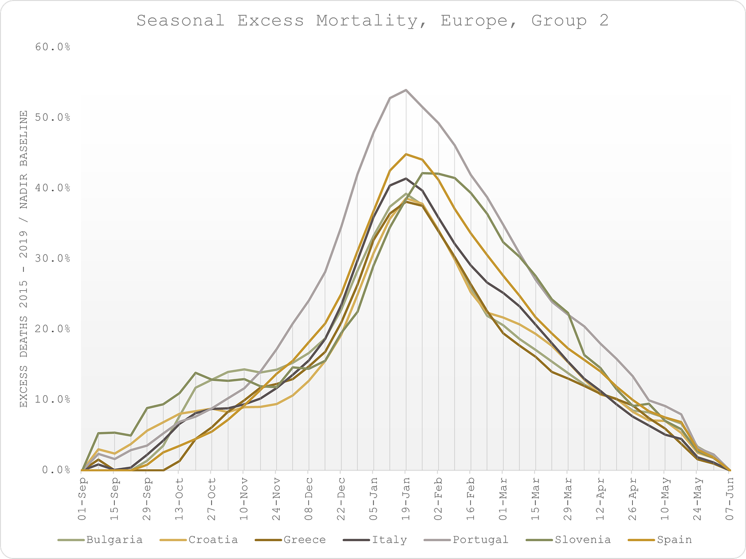
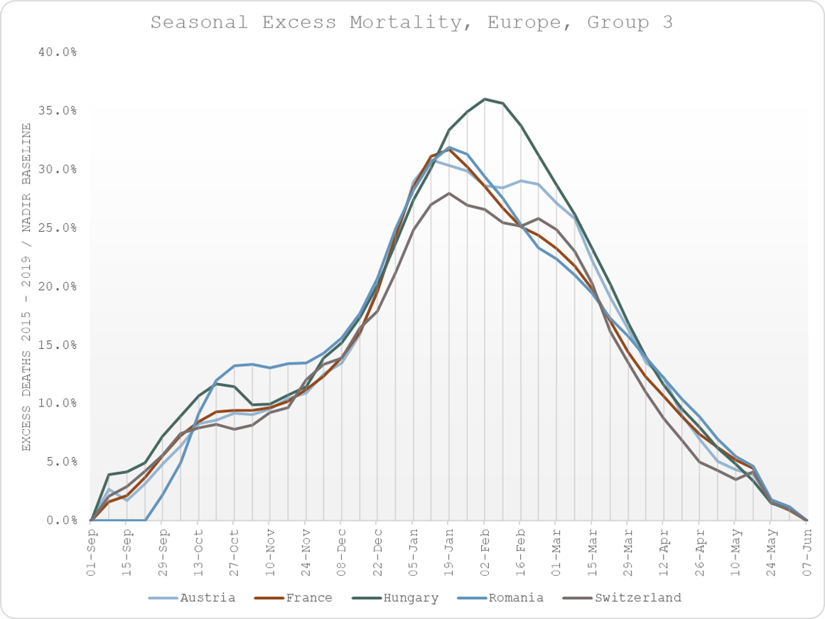
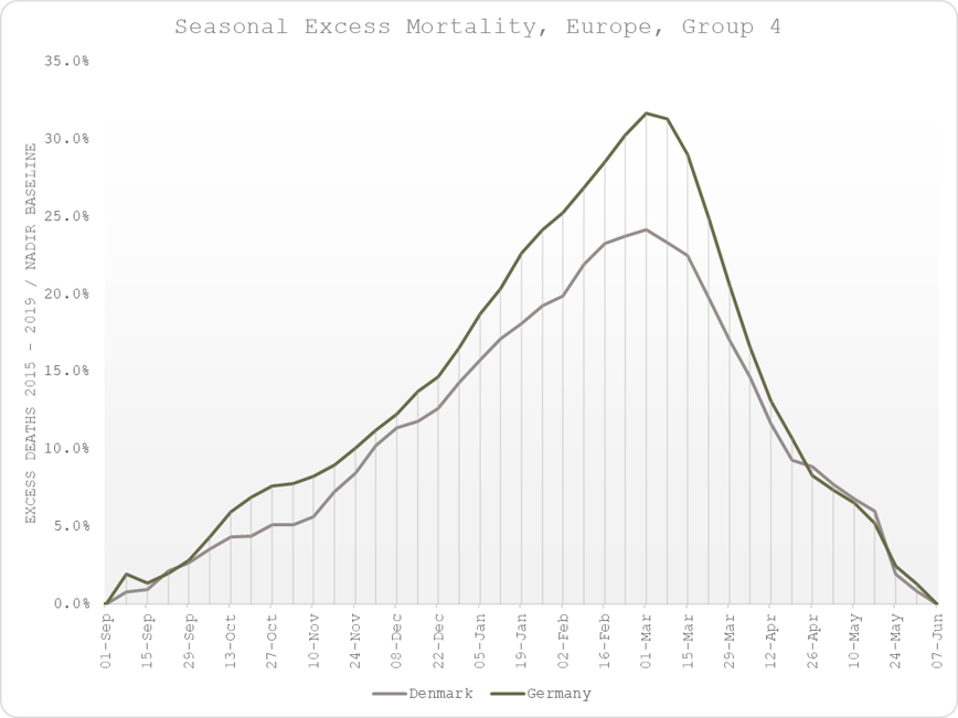
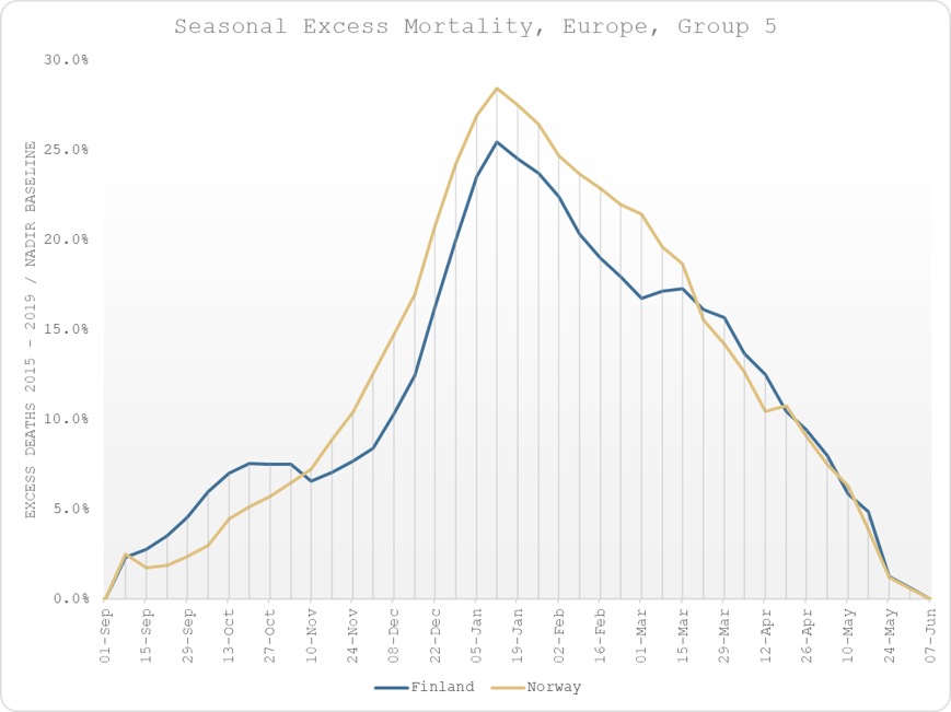
2. The groupings are latitudinal, indicating that climate is a likely factor (sunlight hours » vitamin D levels as surmised by Hope-Simpson).
3. For the three main groups, excess mortality in spring 2020 does not follow the same patterns, suggesting that the course of the virus was not the cause of the excess mortality.
4. Reorganising the countries according to the COVID-era excess mortality reveals a geographical clustering that is not consistent with climactic factors.
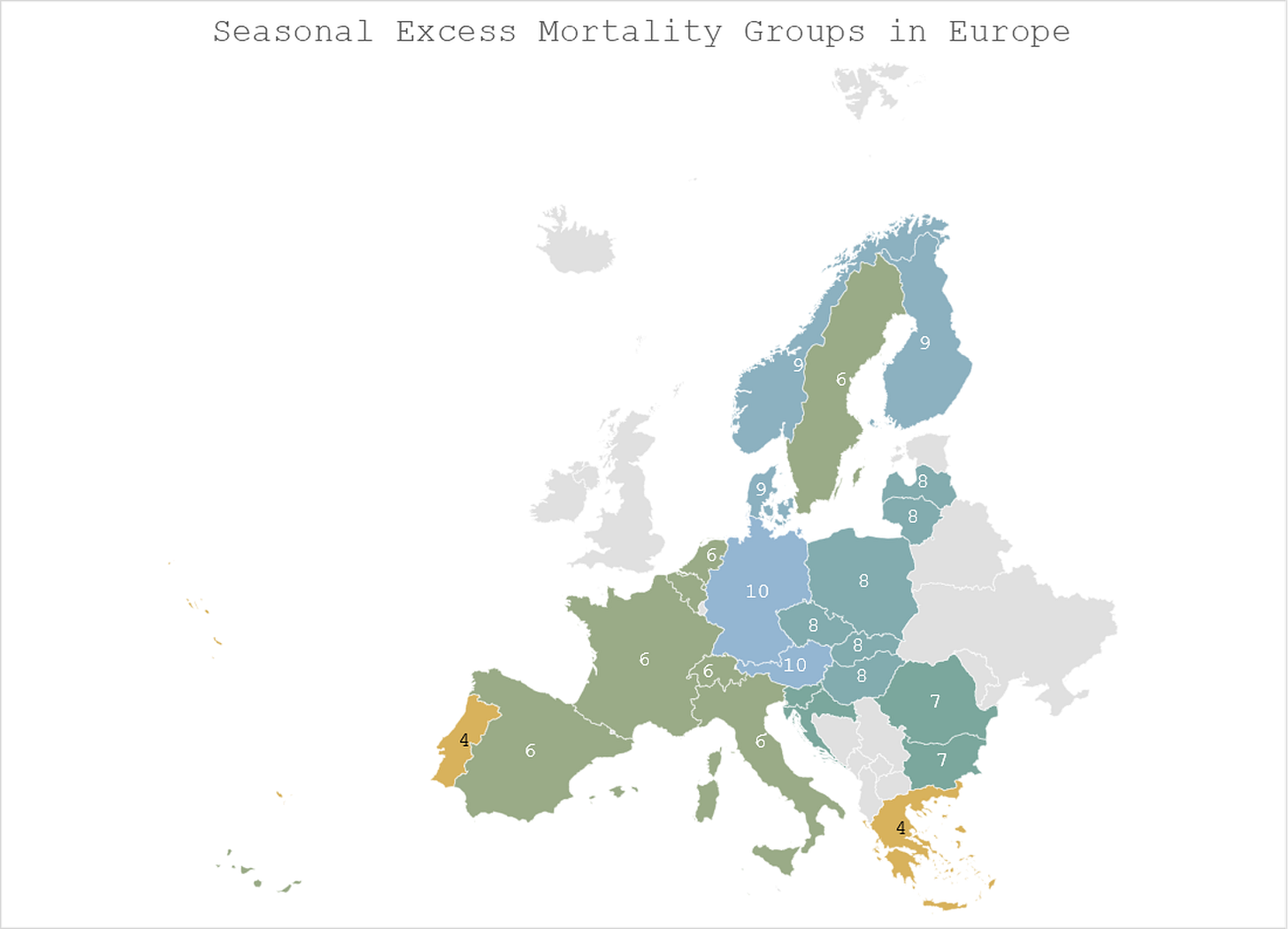
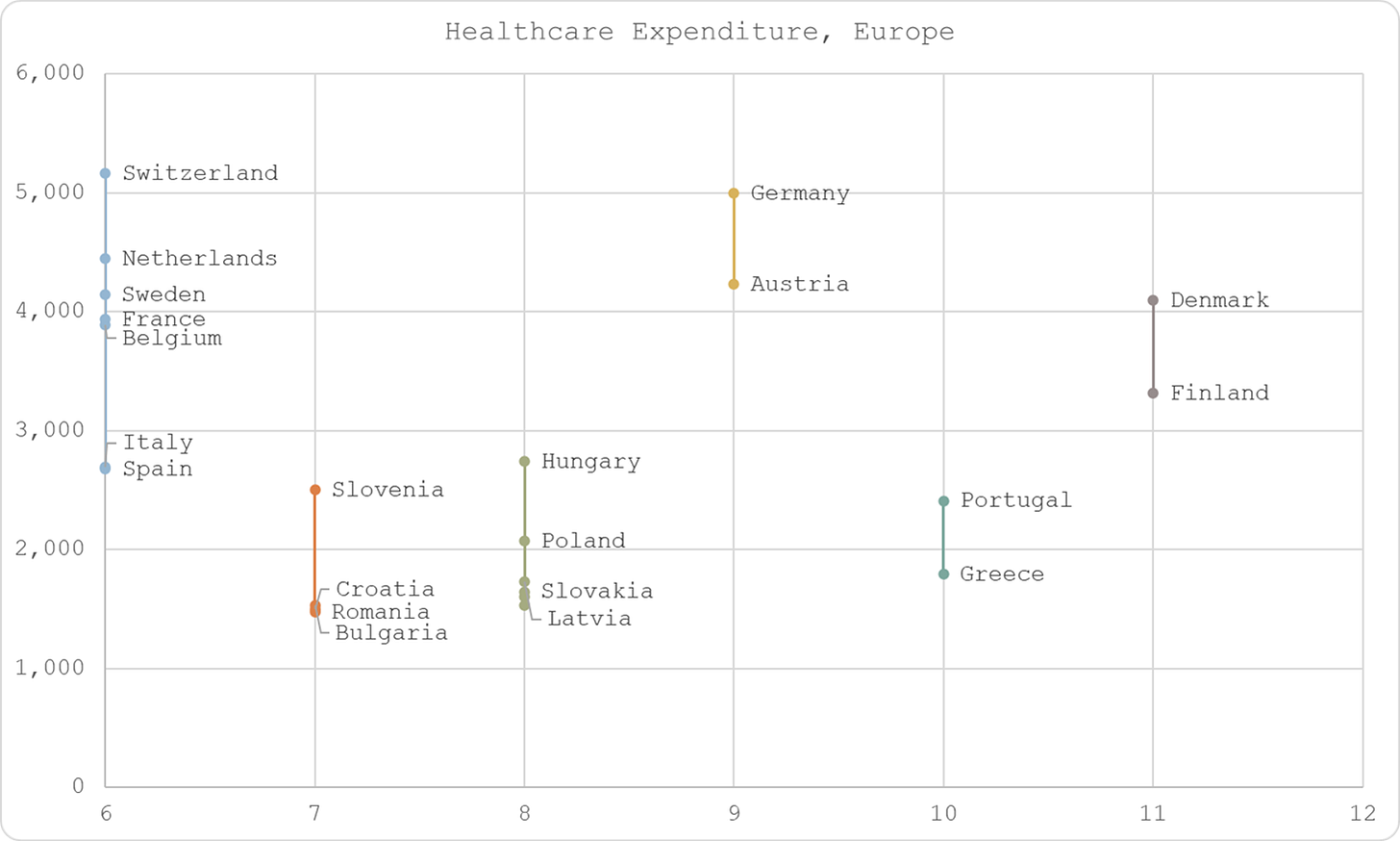
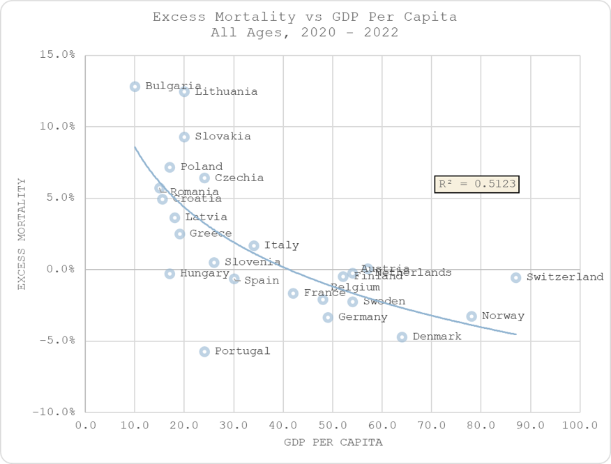
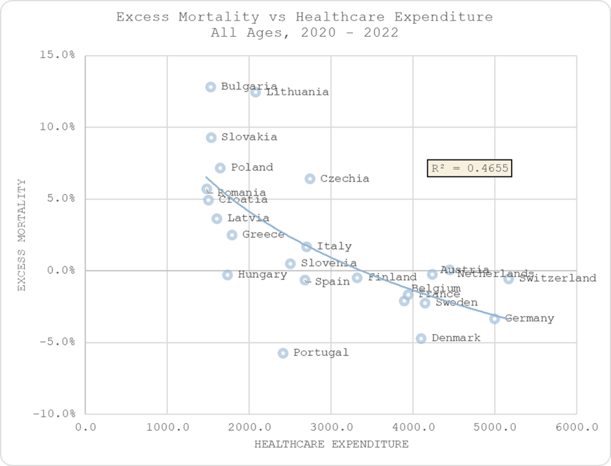
5. However, there does seem to be a relationship with healthcare expenditure (and GDP per capita).
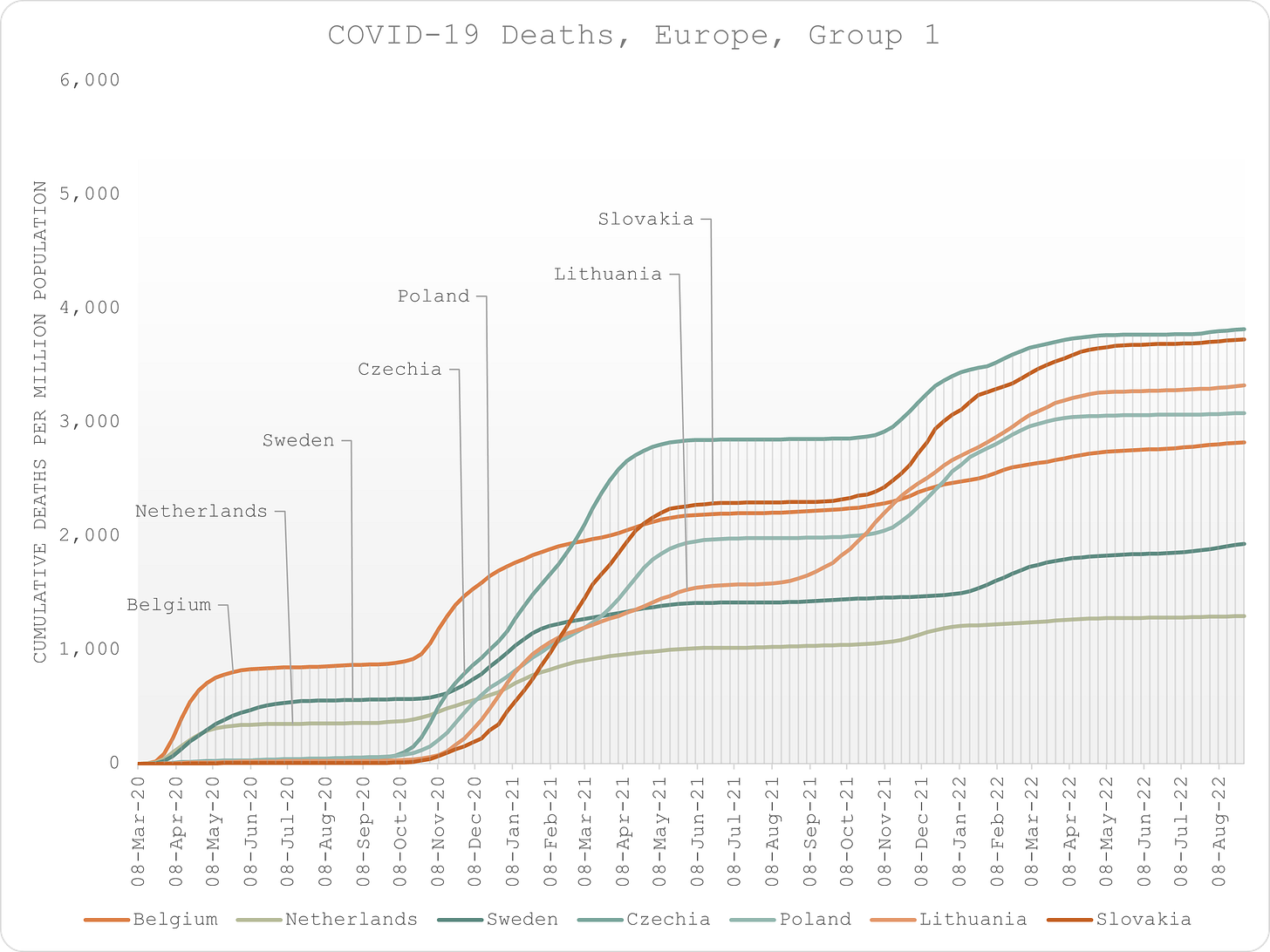
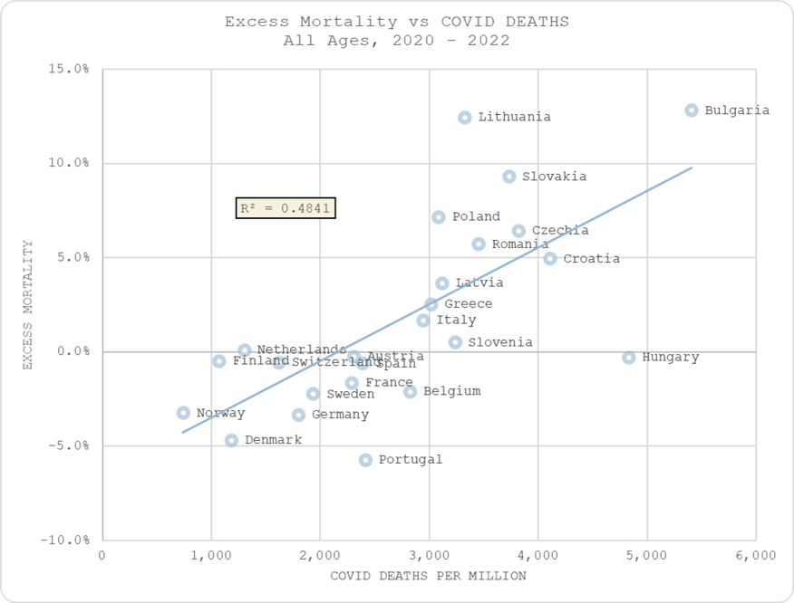
6. There is inevitably a relationship between excess deaths and “COVID” deaths, and there appears to be a strong negative correlation between COVID deaths and levels of vaccination.
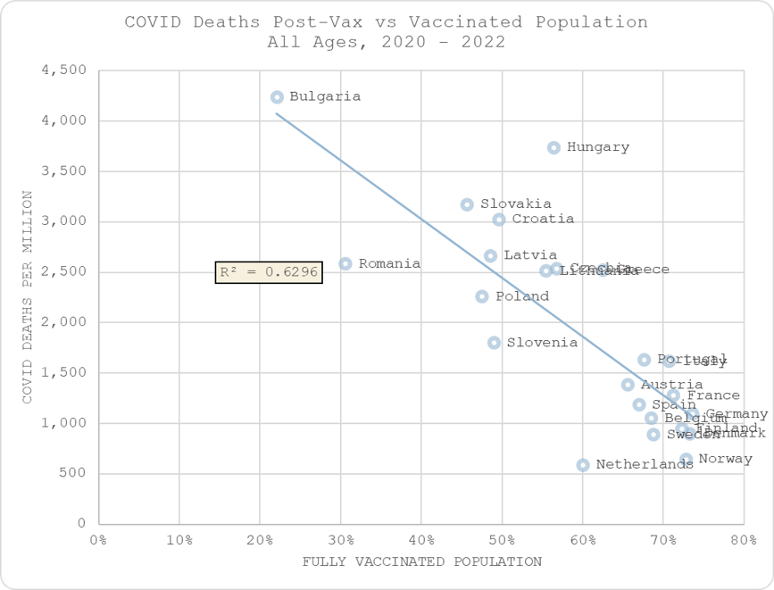
7. But there is no relationship between excess mortality in the post-vax era and levels of vaccination, suggesting that, at best, COVID lives saved are offset by non-COVID deaths caused.
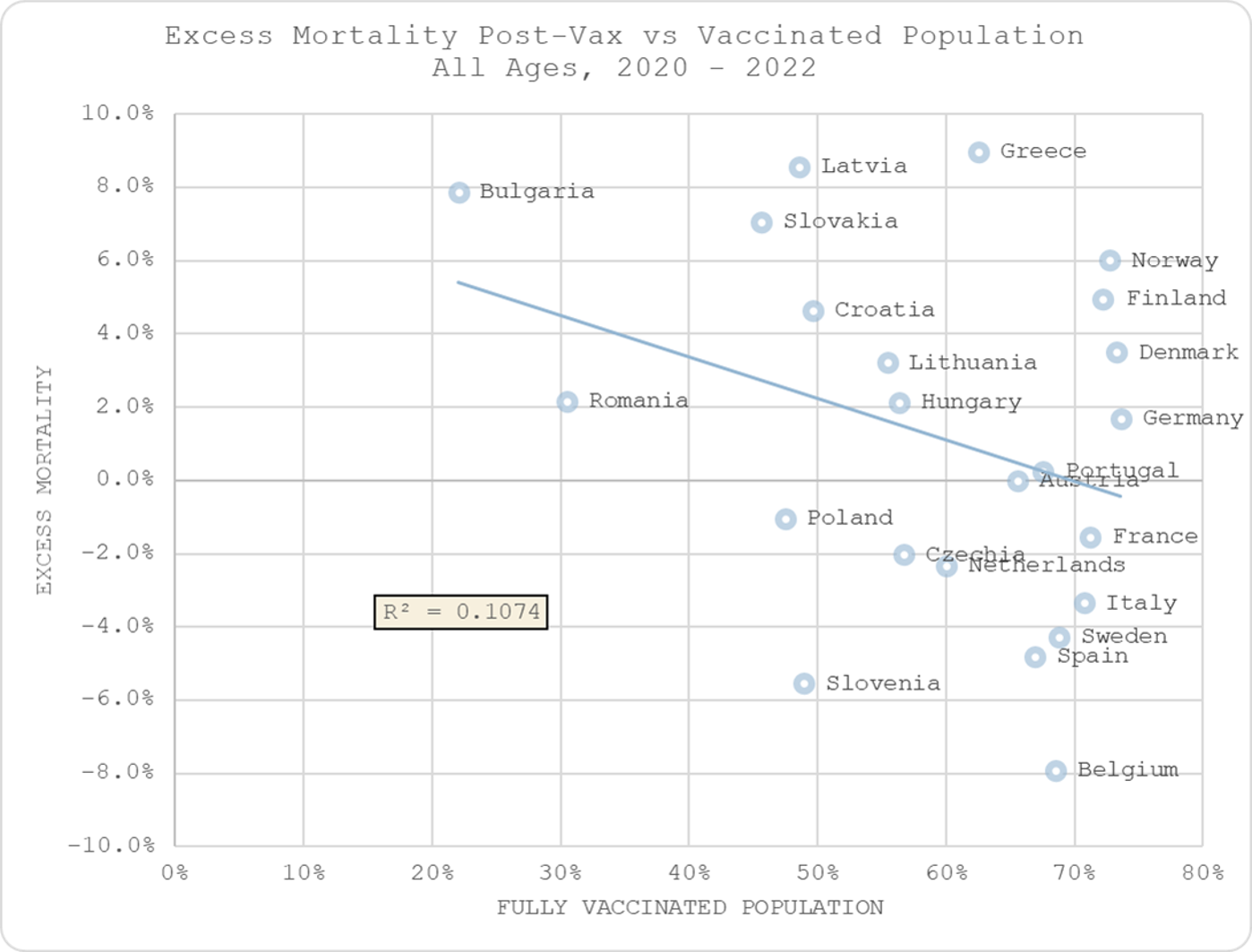
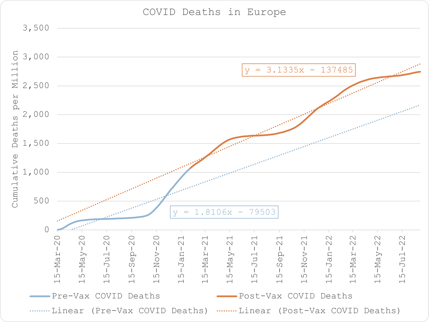
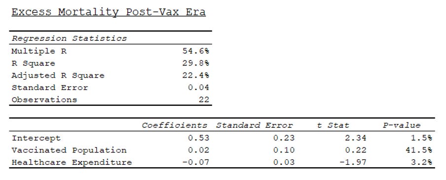
8. Nevertheless, in fact, not only is there substantially more COVID death in the post-vax era, when excess mortality is measured against healthcare expenditure and levels of vaccination, the correlation with vaccination is positive (albeit not statistically significant).
Conclusion
This led me to three preliminary conclusions that require further investigation:
- Excess COVID deaths were not caused by the virus which is seasonal and not mitigated by social distancing “measures”. Excess all-cause deaths resulted from interference with natural defences that rely on sunlight exposure and social interactions as well as a thriving economy.
- Excess COVID deaths were the result of pre-existing quality of healthcare and relative change in that quality, i.e. disruption which was felt more acutely in the wealthier nations who had better systems.
- Post-vax excess deaths due to COVID are caused by the mRNA experiment and any alleged benefit in mitigating COVID deaths, at best, are mitigated by an equal increase in non-COVID excess deaths. The greater incidence of death is due to poorer nations being less well-equipped to deal with the additional burden of disease caused directly and indirectly by the “vaccine”, as well as potentially poorer levels of metabolic health.
Note: As speculative as this may seem, the burden of proof is on those who promoted social distancing measures and genetic vaccination to demonstrate that those actions were not responsible for causing more avoidable death than they potentially saved.
Iatrogenesis in England & Wales
Iatrogenesis in England & Wales
COVID policies and genetic vaccination are responsible for all the excess deaths.
I had a quick look at the latest all-cause mortality by date of occurrence in England & Wales.
Rather than estimating excess deaths relative to prior years, I just looked at it over the years that cover the "pandemic", i.e. from Jan 2019 to Oct 2022.
The results are quite interesting.
As we can clearly see, using this metric, there are only three periods of obvious excess mortality:
Period 1: 22-Mar-20 to 31-May-20
Period 2: 27-Dec-20 to 07-Mar-21
Period 3: 27-Mar-22 to 24-Apr-22
Why is this so interesting? Well, let’s look at COVID deaths over the same time periods.
Period 1
The first recorded COVID death in England & Wales occurs in the week ending 26-Jan-20. there are a handful of other deaths that occur over the next couple of months.
But that’s the odd thing. If COVID is so transmissible, how come there were so few COVID deaths during the peak mortality season? Moreover, how come deaths only explode and are sustained over the period of maximum disruption to the health and social welfare system?
Period 2
There is ostensibly lots of COVID death in autumn 2020 but it does not manifest in any more excess death than the following year. I surmise that this is because, once again, in the absence of significant disruption to the healthcare system (NHS bed occupancy is substantially higher by now than it was during the spring), COVID is not killing at any higher degree than other influenza-like illnesses.
It is only when the hosts are made more vulnerable by the genetic “vaccine” that COVID deaths explode and represent unusually excess periods of mortality, with an initial rise during the first few weeks when the healthcare workers are jabbed, followed by the explosion in January when the elderly and vulnerable are done.
Period 3
COVID deaths in this period are no higher than earlier in this season but they show as excess because they are unusually late.
Initially, I didn’t really know why this excess mortality period might manifest so I was going to leave it as an open question (I also have to go and do the school run so didn’t have any more time to investigate).
But then I thought I’d have a quick look at the Coronavirus Dashboard and lo and behold, I immediately found this - the “Spring Booster” campaign - which “coincidentally” runs from, you guessed it, 27-Mar-22 and curiously tails off into 24-Apr-20 before apparently starting on a new course.
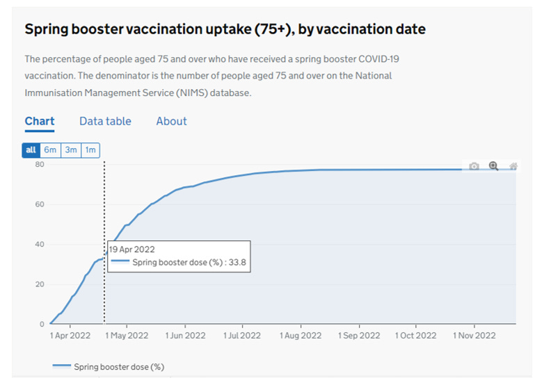
Like I said, interesting, right? Clarifies what they mean by “booster” if nothing else?!
What does this all mean? It means that in the absence of any government intervention, COVID is just a regular ILI, not even a bad one that I used to believe.
Disrupting healthcare and subjecting old people to a novel, risky therapy is really fatal though.
Meanwhile back on the ranch yours truly is trying to find the 20 – 40 seriously quiet hours he needs to nail an iatrogenic harm model; that is, a statistical model that examines the harmful impact of policies, drugs and genetic therapies against a background of respiratory seasonality and incomplete processing of young deaths by the ONS (likely due to delays at the coroner’s end – young folk are not supposed to die).
BTW don’t confuse iatrogenic death with murder! We’re not talking about health professionals bumping people off to meet WEF targets. We’re talking about mistakes, errors of judgement, sloppiness, misdiagnosis, oversight, lack of care, inappropriate protocols and that sort of thing. Often it isn’t an individual at fault but the system of healthcare, which will include systems of patient management that should have been revised or dumped. Much of this can be avoided by regular critical review, which means challenging the status quo, going up against lead clinicians/managers, being open, being flexible and questioning policies across the range of disciplines.
This is some darn strange retirement.
Kettle On!
Original Article:https://www.thelibertybeacon.com/we-gotta-ask-exactly-how-many-people-did-the-alleged-sars-cov-2-virus-actually-kill/


Comments ()